Thanks to a partnership between Font Bureau, Carter & Cone, and Monotype Imaging, Georgia and Verdana are now extended families, enabling much more versatile use on screen and paper.
/via @hellosigit
Thanks to a partnership between Font Bureau, Carter & Cone, and Monotype Imaging, Georgia and Verdana are now extended families, enabling much more versatile use on screen and paper.
/via @hellosigit
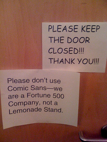
Monologue by Comic Sans. This is probably what Comic Sans would say to that guy who posted the note in Helvetica
Typographer Bruno Maag sets out to eliminate Helvetica with his own alternative called Aktiv Grotesk. I’m all for anything that would remove Helvetica yet over the years there’s been plenty of types that are much better than Helvetica though only one has managed to dent its dominance. Why? Simply because Helvetica is available as a system font while alternatives such as Univers, Haas Unica, Frutiger, and many other similar typefaces are not.
Arial, the ugly doppleganger to Helvetica is popular thanks to Microsoft’s and Apple’s inclusion of the typeface in their respective operating systems.
If they were to include one or more of the alternatives, it would probably be much easier to reduce, if not unseat, the position of both as the seemingly dominant typeface.