Oppo Find 5 Review

image

Back in April I picked up the Oppo Find 5. A solidly built 5-inch Android phone with a 13 megapixel camera, large battery capacity, and high resolution screen. At first glance, it looks something like a model out of the Sony Xperia line with its clean, sleek look with bold lines and all glass face plate. This substantially large phone is out to impress with a big risk in carrying an unknown brand.

For a new player to launch this kind of offensive on the crowded smartphone market is more than brave, perhaps even foolish, but the Find 5 doesn’t seem to break a sweat on the challenge.

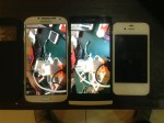
You can read some of my early impressions of the Find 5 and see more photos of the phone on my Flickr set.

Oppo is perhaps better known to some as a consumer electronics company or as a maker of Blu-Ray players but for most people, it’s an entirely unknown brand with no reputation to speak of. Then they went and launch a high end Android smartphone with a funny name and “premium” pricing. Naturally, red flags  went up on people’s minds.

Just about everyone I met since I got the phone wanted to know about the phone. They all gushed about the screen, the responsiveness, the sturdy build and premium-looking design, but when they found out about the brand and the price, pretty much all of them looked at me in disdain. Almost everyone said, “Why should I pay that much for a Chinese phone? So expensive”.

The Jelly Bean-powered Oppo Find 5 sells for Rp 5.5 million in Indonesia, roughly USD 550. When people hear about a Chinese branded phone, they generally think of low cost knock offs, phones that cost between $150-250 with low end or mid-range specs. The reaction they gave when they hear $500 for a Chinese phone is perhaps similar to finding out that you have a contagious skin disease.

Never mind that the Find 5 is in the same class as the Xperia Z and ZL which is just above the Nexus 4 and better than the Galaxy S3. Never mind that the Find 5 is still cheaper than any of the other phones mentioned, save the Nexus 4, which goes for Rp 5 million on standard retail price.

But let’s step past the name, origin, and the price for a moment and take a look at what this phone offers. The Oppo Find 5 is sold as a powerful, high end Android smartphone with a more affordable pricing. 

Packaging

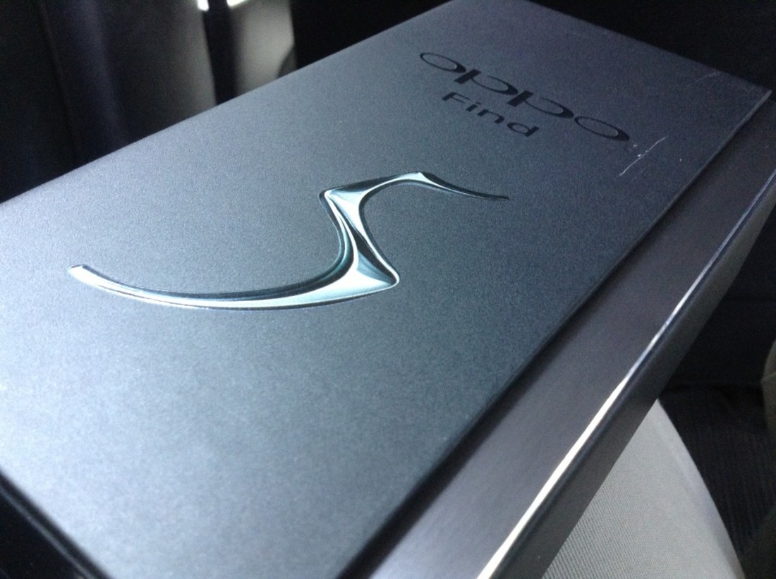
In releasing the phone, Oppo wants to deliver a premium phone experience to a greater range of consumers. This intention can’t be more evident than from the packaging that the Find 5 comes in.

Aside from Apple, Nokia had been the only other mobile device manufacturer that takes great care in how its products are packaged. Both companies carefully pack their devices and their accompanying accessories as well as printed documents inside a packaging that brings delight to those who receive and open them. With the Find 5, Oppo joins that exclusive club.

The clean, matte black box with glossy patterned ends and a magnetic seal across the side of the top really sets it apart from many other smartphone packaging and raised the bar significantly for most other manufacturers. Upon seeing this box, it’s fair to say that the content had to be equally impressive or the entire experience would greatly suffer.

Physical

The back of the box reveals some specification details of the phone. Technically named Oppo X909, it has a 5-inch full high definition screen packing 1920 x 1080 pixels, which gives it a screen density of 441 ppi, the second highest ever released on a mobile device, highest being the HTC One at 468ppi. 

Before you even open the box, you’ll know the screen will give you very sharp and very detailed images. The viewing angle is very wide and you won’t see color desaturation or shift even at sharp angles. Color reproduction is very clear and vivid with great contrast, and video playbacks look great. It’s brilliant.

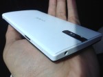
In terms of physical attributes, the Find 5 weighs 165 grams, with a dimension of 141.8 x 68.8 x 8.8 millimeters. Because of the 5-inch screen, the phone is taller than the 4.5-inch Lumia 920 which I dub the aircraft carrier because it is so large and heavy, but it is also thinner, lighter, and slightly narrower. Perhaps the moniker will have to change now.

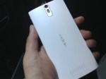
The two tone look with a flat black screen and curved white plastic back gives the phone a very polished professional look. The surface is very clean save for the volume buttons on the right side of the phone, the power button on the opposite side, a 3.5mm audio jack on top and the micro USB port at the bottom. On its back, you’ll find the primary camera perched on top of its double flash LEDs with the speaker grille positioned at the other end. Oppo’s branding is curiously placed horizontally which can easily be misread as Oddo when held the other way around.

Make no mistake, the phone is large but the fact that it’s quite thin with a curved back makes it much easier to handle. The physical button positioning feels perfect but when you want to operate the phone using the soft buttons located right underneath the screen, you have to slide the phone up a little bit to adjust your grip unless you have large hands.

Unfortunately the soft buttons are a little too close to the spacebar when the keyboard is up so when hitting the space bar it’s easy to mistap and hit the home button instead.

Internal

The Find 5 is powered by a 1.5GHz quad core Snapdragon S4 Pro processor, coupled with Adreno 320 GPU and 2GB of RAM. The battery is a very capable non-removable 2500mAh slab which gives the phone two days of light use or one day of standard active use on a single charge. With my typical use however (always on Twitter and Path), 10 hours is the absolute most it will last on a single full charge.

The phone holds 16GB of storage space, with 12.5 GB available for use. According to Phone Storage in the Settings app, it has 2GB of internal phone storage and 10.5GB of phone memory or phone storage.

With the phone entirely enclosed, there’s no way to add more storage through an SD card. Strangely there is an option to erase SD card contents within the storage settings, although it may well have been left there as part of a standard Android feature. In any case, 12.5GB is all the space you’re given with the Find 5 unless you happen to pick up the 32GB model.

Connectivity

The Find 5 runs on multi-band WCDMA and GSM frequencies, covering 850, 900, and 1900 MHz for both networks, as well as 1800 MHz for GSM and 2100 MHz for WCDMA. It’s  world phone that will work just about anywhere on the planet over a GSM or 3G/HSPA network. 

Lack of LTE is not much of a disappointment at this stage but in the few markets with LTE coverage, it’s a slight handicap. With NFC, Bluetooth 4.0, Wi-Fi a/b/g/n, DLNA and FTP support, it’s got enough for speedy data transfers and to serve as an entertainment console. The two NFC stickers included in the package, can be used to trigger certain predetermined actions such as sending the display to a compatible TV, changing profile settings, launching certain apps, and so on.

Cameras

The Find 5 has two cameras, the rear one produces 13 megapixel shots and the front shoots 1.9 MP. Unfortunately they are not excellent cameras. It wouldn’t be fair to compare the rear camera to the 8.7 MP camera on the Lumia 920, but against the 8 MP camera on the iPhone 4S, the Find 5 falls a bit short. In taking low light photos, even the 5 MP camera on the iPad mini manage to take brighter photos. 

Given ample outdoor lighting, the primary camera on the Find 5 performs mostly as expected with sharp and detailed pictures and vivid color reproduction. Take the camera indoors with only standard room lighting, watch the performance drops. Shots become grainy, details are lost, and you’ll get ordinary results with cropped photos. Bottom line, the rear camera on the Find 5 is decent, adequate, and good, but unfortunately, it’s not brilliant for taking photos.

Sample shots can be found on my Google+ posts here and here

Camera Software

There’s a basic set of camera features built in to the Camera app including four resolution options, flash, facial recognition, timer, panorama and HDR and its editing abilities are quite comprehensive with color corrections, filters, cropping, red eye correction, effects, and more.

The built in panorama feature is definitely handy but it doesn’t produce results as good as Nokia’s Panorama or iPhone’s built in panorama. Unlike the iPhone’s portrait pan for panorama, the shot is taken with a horizontal orientation but again, intricate details are often lost in a blur although overall performance is still acceptable. 

The rear camera also takes high definition videos at 1080p. As a video camera, it’s not bad. Pictures look sharp, colors are good, audio is captured well, and it only has minimal blurring on high speed motion. The settings let you choose between high speed and low speed video at 480p or standard speed videos at 720p and 1080p. HDR video option is available only at 1080p recording.

Software

As with most Android devices, manufacturers are free to modify it as they like. They can add remove, or alter almost any part of the Android software package and deliver them with their own custom version. Oppo’s Android 4.1.1 is no less modified. Oppo has said that it is preparing an update to Jelly Bean 4.2 but even with 4.1.1, the phone performs well.

The stock launcher is a let down to be honest. It looks terribly ridiculous, icons are forced into square designs, each application icon is placed on top of this odd gray plate, the widgets have these bubbly shape that serve no purpose but to take up space, it’s just a mess, although the lock screen options are pretty nice. Fortunately it comes with a set of apps that allow you to change the looks of the launcher and if that’s not enough, you can always search for more on Google Play.

It’s important to note that there is an official Cyanogen Mod replacement for the Find 5 which is surprisingly pleasing for those who can’t stand the stock operating software. It’s encouraging to know that Oppo realizes that its current software isn’t really up to snuff and is allowing a well regarded third party custom Android ROM builder to provide it with an alternative. Oppo also has its own effort to deliver an improved  experience called Project Firefly which currently is still in private beta.

The Photo app initially shows only two folders, the Camera and Screenshots folders and this would throw people off if they had downloaded images through the browser, over bluetooth, or had created them using apps. Fortunately there’s a way to make other folders visible if they exist, through the soft menu button below the screen.

Even though the phone runs Jelly Bean (4.1.1) it doesn’t support launching Google Now from the home button but with the right Launcher, it can be modified. A long press of the home button actually opens the list of recently active apps and you can clear them all with a single tap on the Sweep button or manually removing them one by one with a swipe up.

Perhaps a downside to its modified software is that the battery settings show nothing more than what you can see on the toolbar on top. It doesn’t actually have the standard battery usage breakdown and battery life monitoring tool. It’s unclear why Oppo has omitted this, maybe it’s not at all confident about its battery performance.

Bottom line

The Find 5 is a substantial phone. It’s large, wide, tall, and slightly hefty but it’s also very well designed. Overall, the hardware is amazing coming from a company with practically no experience in building a smartphone. Its first smartphone effort  is so well done, it would be a shame if it didn’t catch on in the market. 

It’s not iPhone 5 but it certainly beats the crap out of any phone that Samsung has ever made, and yes, that includes the Galaxy S4. The screen quality is among the top of the market which is important when it’s a device that will get used constantly throughout the day.

Unfortunately, the Find 5 will have to have points taken off of it for poor software implementation and generally average camera. It’s great that Oppo is working on improving the software and even allowing alternatives, but out of the box, it’s not a great experience. 

When that’s finally taken care of, there’s still the issue of the camera. For it to be bested by iPad mini in low light and by the 4S in capturing details and sharpness is embarrassing. It brings down the phone’s otherwise great experience and there’s nothing anyone can do about it. 

The good thing though, ordinary camera performance is only one of the very few low points of the device. The Find 5 is a standout smartphone from a new manufacturer that can already compete in the big leagues with the major players and their long list of experience. 

It’s like Oppo managed to figure out what needs to go into a standout device and packs them in there, or most of them anyway. The packaging is outstanding, the device is well built, well designed, and looks great. The pricing is also competitive for its class.

People just needs to get used to the idea that Chinese brands don’t necessarily mean cut price pedestrian products.

Comparing Oppo Find 5 with Samsung Galaxy S4. Thickness and weight seem pretty identical, so are the camera and screen quality. The Find 5 has a thicker chin though, so it’s taller and its lens’ depth of field is narrower but the S4 produces much sharper and more vivid photos.

So here are the six Oppo Find 5 photos that didn’t get uploaded yesterday. There’s a bunch of annoyances on the software side which takes points off from an otherwise great device.

Oh, and the camera isn’t impressive. Red tint galore when in relatively low light and the sensor produces photos inferior to the Galaxy SIII, which makes it even far more inferior than the Lumia 920. Although I think the SIII may have had a camera software upgrade over the past year. Photos from the SIII never looked so sharp before. Btw those photos of the Find 5 were taken using iPad mini.

Unboxing Oddo… I mean Oppo Find 5

I haven’t seen a packaging this well done and this stylish in a long time. Oppo might be considered a rookie in this space but the company certainly knows how to make a first impression. Haven’t played with the phone much but it does feel pretty decent to hold. Still, I can’t get over the fact that it’s just big. I mean it is a 5” phone. Huge. Taller but thinner and feels lighter than my Lumia 920. Good placement of the power and volume buttons. Not keen on the custom icons and theme though.

Will write a review in the next several days.

[update] I have no idea why the other six photos failed to upload.

It ain’t heavy, it’s my Lumia 920

image

I’ve ditched the iPhone and picked up a bright Ferrari red Lumia 920. I’ve had three iPhones since 2008 and 2013 may well be the first in which I may not own one, at least not a working one. I’ve been using the original iPhone for three years until I left it in a cab early last year, which led me to get myself a used 3GS and later an iPhone 4. The latter of which I promptly left, also in a cab in August of that year, just three months after I bought it, so back to the 3GS I went before it kicked the bucket a few months ago.

Background

The death of my 3GS made way for my Lumia 800, which was given to me by Nokia at the start of the year, to become my primary phone. I had enjoyed using the Lumia from time to time and it had become my primary email device while the 3GS was what I use for everything else. Honestly, loading emails on the 3GS running iOS 5 and later iOS 6 had become so slow it was unbearable.

I’m one of those people who prefer not to deal with phone calls, don’t give out their phone numbers, and refuse to use SMS unless it’s absolutely necessary. Practically all of my communications are done through online text messaging such as email, Twitter, and the occasional Facebook Messenger and WhatsApp, so actually not having a phone works just fine for me. 

My iPod touch could have served me well enough if only it had a SIM card without the phone component, just like the iPad had since 2010. Speaking of which, my iPad is the wifi-only first generation model, so the Lumia 800 doubled as a wireless router while I’m on the move. The iPad mini would actually be perfect but it won’t be available locally until some time next year, so that can wait. 

In the meantime, I’ve been so enamored by the Lumia 800 that when my dreaded suspicion that it won’t be receiving the upgrade to Windows Phone 8 came true, I had to go and get a replacement for it. Between the 820 and the 920, the decision came down to whether the size of the 920 would be a hindrance to my daily use of it. 

Relatively speaking

The Lumia 800 honestly has the perfect size for a mobile phone. It has just the right width and it’s slightly taller than all the older iPhones but not as tall as the iPhone 5. The size doesn’t require anyone to use both hands when using the phone which means typing on it was a breeze. Unfortunately Nokia decided to go large with this year’s first batch of the Windows Phone 8 devices, so that comfort zone had to go away. 

The Lumia 820 is about the size of the older 900 but handles better due to the curved edges of the screen. The flat edge screen of the 900 was a design blunder. It made the already large phone even more uncomfortable to use as the curved sides of the phone meet very hard edges of the screen. I could rant more about the 900’s undeserving release but I’ll spare you the tangent.

The 820 is a “coodabeen” phone. It could have been much better, it could have been the straight up replacement for the 800. It could have been a phone of its own that doesn’t look like its trying to steal customers from the 920 for a whole lot less. It could have been a contender, it could have…  ah you know. It should have had 16GB of storage instead of 8, the screen should have been narrower. It’s too expensive for what it offers. The upcoming Lumia 620 would kick its ass when it comes to value for money. The 820 looks great but it’s too close to the 920 to be able to stand on its own.

The 920 is a much bigger phone than the 900. It packs optical image stabilization, 8.7 megapixel PureView camera, large built in storage, a really fast processor, high capacity battery, built-in wireless charging, the works. Maybe it was a component issue that pushed the company towards a larger phone, maybe it was a conscious design decision that saw the market looking for size. In any case, the 920 is a monster of a phone. It’s an aircraft carrier.

He ain’t heavy

The Lumia 920 is incredibly large. It’s about the same size as a Galaxy SIII but a little bit wider and because it’s rectangular instead of heavily curved like the Galaxy, it looks larger as well. Whereas I had problems using the Galaxy S III because of the size, the 920 is much easier to use because Windows Phone and its apps sensibly put all of the action buttons either at the bottom or not on fixed positions so they can be scrolled easily to within reach. Android’s interface is just like iOS as their on screen button placements tend to be fixed, which make large or tall phones awkward to use.

The weight of the 920 may seem very substantial compared to other phones. At 185 grams, it’s the heaviest among the top smartphones in the market. The iPhone 5 is 112 grams, the iPhone 4S is 140 grams, Galaxy SIII is 133 grams. Even the Lumia 820 is far lighter at 160 grams. Don’t let this get to your head though. Once you got to use the phone on a daily basis, you wouldn’t really notice the weight. Your wallet is probably heavier than the 920. 

Don’t kid yourself, you’re not going to pull a muscle trying to use this phone. Unlike an iPod touch or an iPhone 5, you’re definitely going to notice if it’s missing from your pocket and because it doesn’t suffer from anorexia, you’re not going to worry about breaking it in half. It’s not fragile.

Ultimately the size and weight of the 920 are issues that can easily be set aside. The 920 is simply a great phone. It’s downright incredible. The built is solid, the screen feels pretty tough and very responsive, you can store a lot of songs, videos, and photos with 32GB of storage. 

Wireless charging wasn’t a deal breaker for me and to be honest I probably won’t be getting the wireless charger. NFC would be very handy if there are more people and places using it. For the moment, it won’t get much use. It’s a solution looking to get used.

Camera

What got me sold on the 920 is the promise of a great camera and because Windows Phone 7.5 had brought a very capable camera software that’s easy to use and practical. Naturally I expected the same from Windows Phone 8 but I wasn’t prepared for the changes that it had brought in terms of software.

This phone’s drawcard is the rear-facing camera. Yes, Nokia simulated the 920’s image stabilization function when it showed off a video at the announcement of the phone instead of actually using it to record the sequence, but the camera does hold true. The floating lens definitely help reduce the shaky motion produced when holding the phone by hand to record video.

The lens also allows more lighting to enter which produces brighter pictures at low lights. The resulting photos are generally much improved compared to the ones taken with a Lumia 800. It produces much brighter photos with relatively sharper details and less noise. Photos produced by this 8.7 megapixel camera come out looking really great although in terms of colors, the iPhone in my view still produces them more accurately than any of the Lumia phones.

The rear-facing camera can produce a very narrow depth of field which makes macro shots stand out that much more although slight barreling (curving of the edges) occurs in close ups of flat objects but most people probably won’t notice it much on casual shots. Unfortunately there is a bug that caused some photos to lose details.

There is a software update to fix the camera bug as well as delivering many other enhancements to the operating system but while it was released for Lumia owners in North America, apparently International versions of Lumia 920 won’t receive the update until at least February 2013. 

The front-facing camera is great for shooting videos and making video calls but not much to talk about for self pictures. The screen flickers when shooting in low light and it produces a significant purple tint over the photo. It’s handy to have but it’s very mediocre.

Camera software

Nokia provides a range of photo apps to accompany the rather basic Camera app on Windows Phone. These apps definitely add to the experience in taking and sharing photos using a Lumia. 

The way it worked in the Lumia 800 with Windows Phone 7.5 was that all of Nokia’s camera enhancement and add on software which came in the Nokia Camera Extras application got placed inside the camera app, accessible from the top side of the menu. This makes them very convenient to access. The menu items are neatly arranged on a selection screen making them easy to spot.

On Windows Phone 8, the enhancements are separate apps that you have to download individually from the Nokia Collection inside Windows Phone Store. Fortunately they do end up being accessible in the Lenses section of the Camera app, so that’s not much of a loss, but the add-ons work differently and I’m not sure it’s for the better. In addition, the self timer is missing.

Cinemagraph can be a fun toy to play with to produce those moving photos in which a part or parts of the photo move as the rest remain still. It can be difficult to create the perfect cinemagraph so it’ll take a lot of practice but once you get the hang of it, it beats the pants of having to learn how to use Final Cut Pro or After Effects to create them.

Nokia Creative Studio is one photo editing app that has changed in purpose. Back on Windows Phone 7.5 Creative Studio let people add all sorts of effects and filters. It had warp effects, adjustment comparisons, visual stylings, as well as the regular filters. It was a fun app.

The new Creative Studio for Windows Phone 8 discarded all of those and turned it into a no-frills photo editing software. It lets you impose filters on photos, adjust brightness, color balance, vibrance, crop, rotate, and remove red eye. Is it less useful? Perhaps, depending on your intentions, but it’s definitely a lot less fun to use. Losing the ability to directly compare the original with the edited version of a photo is regrettable.

Photo Beamer is Nokia’s solution to on-site photo sharing. Lumia owners can share their photos to another device by opening the photobeamer website on a browser on the target device and holding the Lumia in front to capture the resulting QR code which will turn the Lumia into a controller for the slide show. This would be useful for presentations or to share photos during family reunions.

Smart Shoot is an app that lets you take five consecutive shots of the same scene, person, or a group of people and based on those five shots, erase unwanted objects and select the best faces possible. The app will then stitch the photos together and come up with a refined photo. You can save the set and come back to it at any time if you want to different versions of the same scene.

Other Nokia apps

While the Camera and Camera Extras play a significant part in selecting the Nokia Lumia over Windows Phones from other manufacturers, Nokia’s in-house collection of apps also add a major factor in the decision. 

Other Windows Phone manufacturers haven’t been as aggressive as Nokia in terms of providing accompanying software and because these Nokia apps are made available for free for all Nokia Lumia phones, it’s a no brainer. Although Nokia Maps is the default maps app for Windows Phone, many of Nokia’s other apps are only available for Nokia phones. They’re not essential and in some cases unnecessary but they can be very convenient to have.

Nokia City Lens is a city discovery app which uses augmented reality to display places of interest around your location. You can look up banks, restaurants, accommodation, entertainment venues, landmarks, and shopping centers.

For those who commute, Nokia Drive provides offline driving directions, learns your routes and driving habits, scans for traffic condition to help you plan your route, while Nokia Transport provides information on bus stops, train stations, and where available, public transport schedules and routes.

Nokia Xpress is like Opera mini which is not available for Windows Phone. Xpress is a web browser that compresses the amount of data used when opening web pages. The app also has a news reader of sorts which it calls Magazine. It pulls in ten of the latest entries from your subscribed sites and displays the first paragraph of each with a link to the full article. There’s also a saved pages section for articles that you want to keep.

It’s a pretty great phone

The one thing I haven’t discussed so far is the battery. In the week since I’ve had the phone, it’s given me mixed results. Sometimes, with only half the battery remaining, I could get up to 6 hours even while I use the phone to check Twitter using the mobile site and send text messages over WhatsApp. Other times, a full battery lasts only 8 hours because I had tethering on while also using the phone to scan Twitter using the native apps.

Battery performance will also be affected by the active background tasks used by apps such as email, Twitter, text messaging, news apps, weather apps, Flickr, and so on, not to mention the signal strength from your mobile network carrier because in places with weak network signal, the battery will be pushed to deliver more power to maintain connection. Using WiFi wherever available though, would save battery use.

All in all, the Lumia 920 is definitely a phone to consider when buying a new phone. The combination of a solid hardware, great camera, free comprehensive software collection from Nokia, and Windows Phone 8 make the 920 one of the best phones of the year.

Thought via Path

The new search on Path 2.9 is an acceptable feature in lieu of actual periodical query, which may yet still be added. For people who treat Path as a personal blog, being able to search posts by month would be priceless.

If it had tags to categorize them, it’d be even better. And then we’d have Path as the ultimate mobile blog network, going head to head with Blogger and WordPress but for private audience. It might supplant Facebook for this purpose because I don’t think people use Facebook in this way even though its clearly capable of doing that.

I think my mind just exploded with ideas. – Read on Path.

Review: Samsung Galaxy S III

Of all the phones that I’ve ever had to use, I’ve never had one anywhere near as large as the Samsung Galaxy S III. At 4.8 inches, the S III is the largest phone I’ve ever held in my hand, but it’s also the thinnest. The screen is simply enormous and it is quite a sight to behold. It is also very clear and very sharp. This new flagship phone from Samsung runs Google’s latest version of Android, called Ice Cream Sandwich, and comes in two colors which it calls Marble White and Pebble Blue. It officially retails for Rp 6,999,000 (USD 740).

I hardly ever use the telephone function on these so-called smartphones. As far as I’m concerned, these are data pads, mobile devices that take advantage of the high speed cellular connections for various Internet-reliant apps and services, and for this purpose, the S III simply screams. It’s clearly up there among the best, if not the best Android phone I’ve ever used.

The S III comes with several Samsung-exclusive apps and features including the S Beam, S Memo, S Planner, S Voice, Smart Stay, Direct Call, and an early beta version of Flipboard through the Samsung Store. Owners of the S III are entitled to receive 50GB of Dropbox storage for two years, which is double that of the offering from HTC.

The S Beam allows you to exchange files with other Samsung phones that carry this app by only bumping the phones together over a special wireless network that needs to be activated from the phone. Unfortunately at this moment this means the feature works only among S III phones.

The S Voice is Samsung’s answer to Siri. Voice recognition on this device is pretty decent but you’ll probably still find it faster to just type things out because it would sometimes dictate the words wrong, even if you don’t have a thick accent.

While S Planner and S Memo sound pretty explanatory, Smart Stay is one feature that Samsung seems to be very proud of. It lets the screen to remain bright and active by tracking your eyes through the camera. Unfortunately even though it does have a disclaimer that it needs a bright environment to perform properly, this is one feature that rarely works and therefore falls under the category of plain old gimmick.

Flipboard is an app that has become crucial to my daily routine. If older people are attached to their newspapers, Flipboard is what I read every morning and whenever there’s a free time and to have the app available from the Samsung Store is almost a godsend. To get Flipboard from the Samsung Store you’ll have to sign up for a Samsung account, but it seems that the exclusive period has ended and you can get the app by signing up for a beta program directly through Flipboard’s website.

If you already have a Dropbox account, you won’t need to sign up for a new one as the Dropbox entitlement will simply be added to your account. While the promo says 50GB, it’s actually 48GB on top of the standard free 2GB, so if you sign in to Dropbox from the S III with your existing account, you will have 48GB added to your account. In other words, if you already scored 16GB from the referral scheme, you will now have 64GB of Dropbox storage. Just remember that the extra 48GB will expire after two years.

On the hardware side, the rear camera captures videos at 1080p high definition and photos at eight megapixels, while the front camera produces two megapixel shots and VGA recording. Both cameras take really good photos, especially the rear camera which takes amazingly sharp and detailed photos. Due to the position of the front-facing camera, which is a little bit off center, video calls can look a little bit off in terms of angle. Facial recognition isn’t much to talk about, probably best ignored because it would fail half the time.

The battery on the S III is pretty decent. From a full charge, the phone would last for 10-12 hours with significant Internet use thanks to the 2100mAh battery capacity. If you rely more on WiFi, it would easily last longer. Given the capacity of the phone, I expected more out of it but since the screen is quite large, getting up to 12 hours with my regular usage pattern is perhaps reasonable.

The phone is very thin, quite light, and easy to carry although it feels plasticky and hollow. Somehow this seems to be a trademark of Samsung’s as the Galaxy S, the Galaxy Y, and even the Tab, all have that same feel. 

In short, the Galaxy S III is clearly a phone that’s ahead of the pack. A lot of the Samsung-exclusive apps may be not much more than gimmicks but the device itself does the job very well. It wouldn’t be surprising to see this phone on top of the Android line up, even ahead of the benchmark Galaxy Nexus.

On a personal level, this phone is a bit difficult to use due to its size. Having used to the iPhone’s 3.5-inch screen and the N9’s 3.9-inch screen, going beyond 4 inches posed a lot of typing and usability issues. If you’re the kind of person who would use such a device with two hands, it might not be a problem but for those who are used to using smartphones one handed, anything beyond a 4-inch screen would require some palm acrobatics, or resort to using two hands.

Oh one last thing, the Motion feature set is certainly one that is worth checking out and what is probably my favorite Motion feature of the phone is the screenshot action. On other Samsung phones you press a combination of physical buttons to take a screenshot, but on the S III, you can swipe the side of your palm across the entire screen from one side to the other and it will capture it for you. It can be hit and miss from time to time due to your hand pressing too hard on the screen, but it’s certainly pretty cool.

Today Tumblr rolled out a completely rewritten iPhone app. Gone is the two panel interface replaced by a tabbed interface that’s becoming more and more common on recent iOS apps and at a glance would remind you of Instagram. The center tab is the primary activity tab for posting content with options to choose which Tumblr account to post it from.

The new app introduces post settings on the composition screen, accessible by swiping the screen to the right. While on the post settings page, swiping to the left takes you back to the composition page.

Due to the way iOS apps are traditionally designed, it’s very tempting to tap on the top left button on the screen where the back/return button is usually located, to go back to composing a post. You don’t want to do this as that position is used by a cancel button that thankfully prompts you with an option to save or clear the post instead of abandoning it outright.

On the settings page, Tumblr finally adds a custom tweet option so now tweets don’t need to come out looking like a mess.

Now that there’s a tab for Likes, you can look at all the posts that you’ve marked on Tumblr directly in the app without having to go to the website on a desktop, notebook, or tablet computer.

Tumblr now allows account creation right on the app as well as reading and replying to messages, recognizing the fact that having to go to the website to do all this is becoming tedious and that for a lot of people, the mobile device is the primary interface to the Internet.

Overall, the app is now much more comprehensive, more usable, and more practical with an interface that makes it easier for you to post more frequently to all the multiple Tumblr blogs that you may have.

Just about everybody’s linked to this epic review of Color on the US App Store by someone who goes by the name Ghostmoth and you’re more likely to have read it since it went up a few days ago.

What’s the fuss? The fact that the team behind Color got $41 million in seed funding from a number of investors while the app so far has caused nothing but confusion among its users. TechCrunch is clearly obsessed by the startup, they’ve devoted a week’s worth of coverage to it.

Here’s the link to Mike Cohen’s original post on his discovery of the review but if you’d rather read it in its full glory, here’s a screenshot of the entire description from the App Store on iTunes on my Flickr account.

Creative writing has reached another high this past weekend.

Simplenote. The notes app Apple should have came up with

Being a web oriented writer, I don’t have too much to ask from a text app, just one that has a built in word and character counts and a simple interface. I don’t find the need for text formatting or all the other fancy stuff that many word processing apps offer. Most of the stuff I do don’t even warrant text formatting although there’s that thing with embedding links in text.

Apple’s Notes in iOS is as simple as it gets but it requires me to copy out the text and put it into Pastebot because it doesn’t have word count, which is important in what I do. Notes also uses Marker Felt which tries to look friendly but reminds me of Comic Sans too much.

Along comes Simplenote. It’s the Notes app Apple should have came up with for the iOS. I’ve been using it for a while but it’s been recently updated. I suggest you read Shawn Blanc’s review of it.