
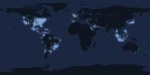
Light map from tweetping shows the most active regions on Twitter throughout the day
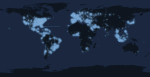
Light map from tweetping shows the most active regions on Twitter throughout the day

World Map of the Day: Facebook data infrastructure engineering team intern Paul was “interested in seeing how geography and political borders affected where people lived relative to their friends,” so he plugged a sample of approx. ten million pairs of friends into the open-source statistics environment R. He played around with the data until he managed to get the effect he wanted.
After a few minutes of rendering, the new plot appeared, and I was a bit taken aback by what I saw. The blob had turned into a surprisingly detailed map of the world. Not only were continents visible, certain international borders were apparent as well. What really struck me, though, was knowing that the lines didn’t represent coasts or rivers or political borders, but real human relationships. Each line might represent a friendship made while travelling, a family member abroad, or an old college friend pulled away by the various forces of life.
Click here for hi-res.
[facebook.]

Typographic Cartography of the Day: “World Typomap” by German graphic designer Dirk Schächter.
Desktop wallpaper and print purchase info available here.
[dyt.]
