
How to use Facebook Timeline | The Verge
Everything you need to know about how to set it up, tweak your privacy settings, and more
How to use Facebook Timeline | The Verge
Everything you need to know about how to set it up, tweak your privacy settings, and more
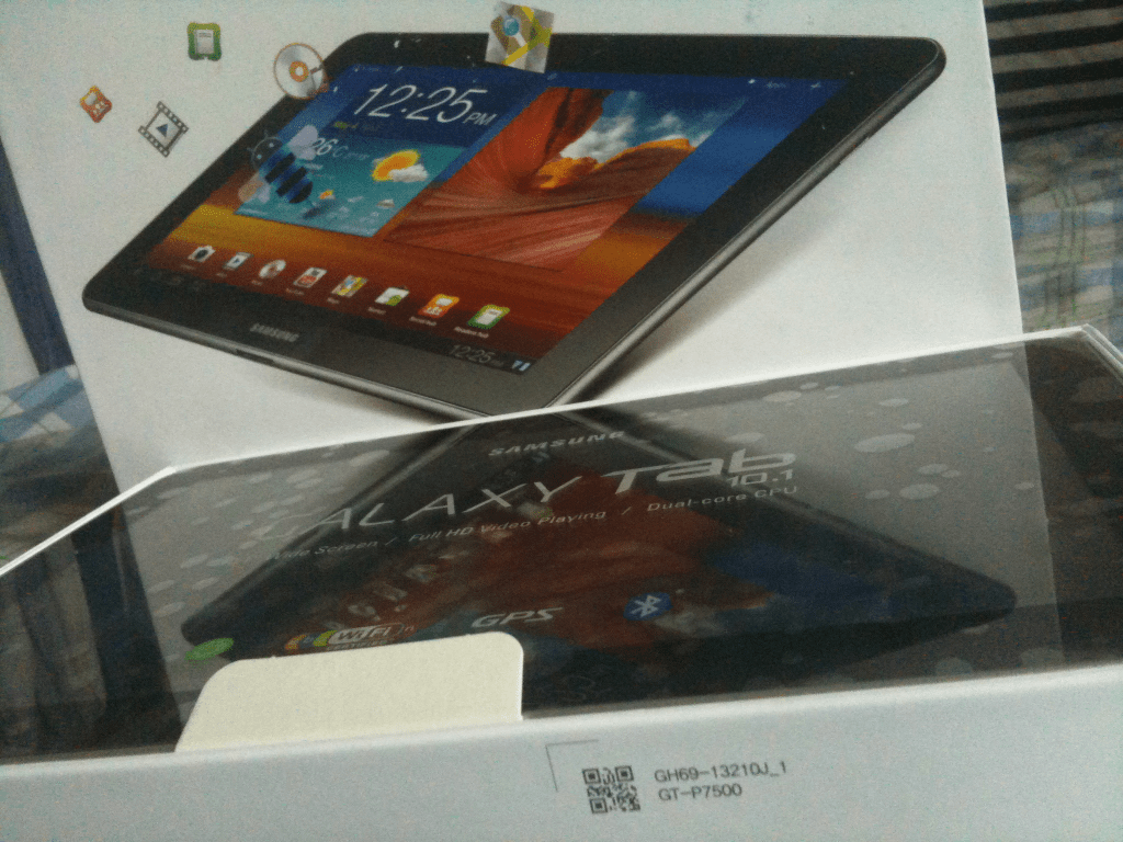
I have in my possession a 16 GB Samsung Galaxy Tab 10.1" 3G. Yes, a 3G model. It was given to me a short while ago but I didn’t realize what it was until I opened the package last night.
With a collection of gadgets already in my possession, I don’t feel the need to keep this one and I have no interest in keeping it anyway.
Now, for someone whose life relies on the ins and outs of technology, I still feel compelled to actually try it out and see what having an Android tablet is like.
The fact that it’s running Honeycomb 3.1 seems pretty cool, at least it’s relatively current, given that Android 4.0 isn’t going to be available for the non-Nexus phones for a while yet.
I’ve tinkered with it a little bit but if I can’t figure the whole thing out in 48 hours, I don’t think I’ll be able to figure it out in a week. Regardless, this thing is for sale. If anyone wants it, they can contact me over email for an offer, aulia.m @gmail. Good only for people in or around Jakarta. I don’t plan to arrange for shipping.
Engadget reports:
The company’s co-CEO,Mike Lazaridis, reports that, due to a critical chipset that’s not expected to be available in production quantity until mid-next year, we’re unlikely to see a BlackBerry 10 device emerge until late in 2012.
Todd Wood, SVP Industrial Design, Research in Motion:
Giving us a glimpse at what is to come, Wood tells us where the latest design workshop for 2012s models was held. This time, rather than the classic scenery of Italy, the design workshop session was in Malmo, Sweden. The latest words for the experience? “Charming, whimsical, and fun” according to Wood suggesting a very different direction from the company.

Coincidence or intentional, it’s pretty cool how the signs line up. @tehawesome. Teh awesome indeed. Guess what’s next on the keyboard? It’s the $ sign! 😀
Lo Min Ming, former UX designer intern at Google:
The reason why there are such differences in these Google apps is that the designers in each of these teams know that Android design is ugly. They all want to change the standard popup design. They want to change the icons. They want to tweak the style. Both the Currents and Google+ team clearly wanted a more flat look compared to the more 3D look of other apps.
I used to rant a lot about Google web services – Search vs Maps vs Gmail vs News, etc. But with the recent efforts to unify the look of these web services to use design language of Google+, they now look much better. More importantly, these web services have a more consistent feel to it.
Let’s hope that they do something across all their Android apps too.
Google Currents adds to interface inconsistencies across Google’s mobile apps

N9 has 35 built in apps including eight third party apps (and a shortcut to mobile YouTube). At least on the one I got.
It’s aaaaall about choice.
Why Don’t We Do Something – Hey Geronimo

